Friday, 27 November 2015

Main Menu Cont.

Continuing from the original menu concepts, here is the final title menu. As the menu loads up, a curtain will move from the center across the screen revealing the buttons.
On some of the icons in the menus are these candles, it breaks up the buttons and makes them less uniform. Candles play a large part of our game and so they are present among the UI elements too.

The background for the menu is a separate scene from the main game, created by the game designer (Ryan). The spot light gives extra colour to the stage without distracting from the menu. This also depicts the confirmation screen when you try to exit the game.
This is the script our game designer used to create the menus.

Friday, 20 November 2015

Material Textures

Throughout the project we had no textures on the environment models. The GUI artist went ahead and created a set of 2k materials. These were originally created for use on the UI elements, all of them were made using Photoshop from scratch. The materials were made so large so that all the icon and objects using they didn't appear repeated.
Below are some of the examples.
 Tiled Floor.
 Chair Fabric.
 Gold.
 Door Lock.
Wood.

Thursday, 19 November 2015

Placeholder Character

As the final character is still in the works, the GUI and Game Designer modeled and rigged a placeholder character to test in-game. Using the concept artists original designs our GUI artist created a character in ZBrush before moving it into Maya to lower the poly count and rig it. With the help of our Game Designer we finished the rigged model and placed it in Unity.
This is the model created, it is a total of 8336 tris, this is under the 10000 tris limit.

The control rig was also completed as seen here in a pose. This was so the game designer could make and test the scripts that would be used on the final model eventually.

Wednesday, 18 November 2015

In-game UI


This is what the in-game UI is currently in the game. The only thing missing is the character portrait, but without a concept artist, we have yet to add one.
In the top left is the options menu, alternatively you can press "esc" to access it. On the left side is the candle timer; this slowly melts as time passes, next to that is the key inventory. If you are missing a key, it will appear as a silhouette. in the center of the screen is the failure menu, allowing you to quit or return to the main menu.
Our game designer (Ryan) created the menu and inventories inner workings, here is a section of the script, it primarily contains the script for key pickups.

 These icons are the other GUI elements that aren't always present. The first is the replaced cursor and the second is the dialogue box for any information we need to present to the player, not including the notes.

Scripts

The code for the game was written by the Game Designer (Ryan) the following images feature examples of the code used within the game, some of the code was sourced and re-purposed form projects within lectures and test files. 
The previous image is the code for our pause menu within the game, the Designer used different gameobjects and UI objects to link menu items together to make a seamless experience.  


Custom Cursor Script


Tuesday, 17 November 2015

Level Design Cont.

This post will explain the mechanics and flow of the level. Its has still not been finalised, so not all the keys/note/etc. are present. After the player has chosen to start the game through the main menu, they will be shown a short cut-scene of the level.
 As our team no longer has a concept artist, we don't have a proper cut scene with 2D assets, so we've decided on a simple fly-through of our level, this will give the player a direction of where to go.
 This is the entrance hall. The player character will begin in this location and progress through the facing doorway into the atrium. The lighting around the character is still the spotlight from the cut-scene.
 After giving control to player, a dialogue box appears. Our character explains that he must make it to the stage in time for his performance. This is the lighting the player will continue through the level with, the light travels further in the direction the character is aiming.
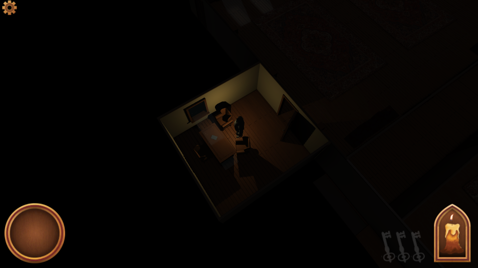
 This is the managers office. The first note the player finds will be located here, on the desk. The note will in fact be visible from a distance due to a beam of moonlight through the window. These moonlight effects are visible elsewhere in the level also.
 Here is a view from the alternate camera mode, using the up and down arrow keys the angle can be changed.
 These are the notes the player will find scattered around the level. They will detail a short letter concerning the whereabouts of a key or object of significance.

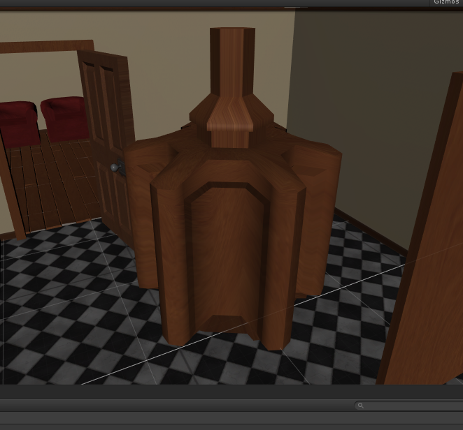
  This image is the location of a key in the environment, the player can in fact search for the keys without the need for reading the notes. But unlike the notes, the keys are very obscured, and the player must use their light to locate them effectively.

This depicts the nav-mesh for the level.

Monday, 16 November 2015

Main Menu

The teams GUI artist has been working on the designs for the main menu of the game. These designs were influenced by the colours and materials found in Opera Houses, we wanted all the UI to be ornate and follow a strict colour palette. One of the most important things was to make sure it all stood out against the background, without taking detail away from it. this first image is the final title for our game, and it will be present in the games opening.
 This second image is the template for most buttons that will be found within the menus, I gave a beveled edge to it so that it does not appear as sharp.

this final image is a mockup of the what the menu may look like, we currently don't have a background, so I used an early screenshot.

Tuesday, 10 November 2015

Level Design

With the level's layout now at completion, we can begin work on populating it and adding the various door puzzles. To further progress in the level you must collect notes to find out the location of keys and information on how to solve puzzles. As the game is set in an Opera, the character must find his way to the main stage for his performance.


Each room in the level is themed around some purpose, each room is there for a real world reason. For example; offices, changing rooms, storage, etc.

The player will have to explore each room, and with the added disadvantage of limited vision, this will challenge the player to be thorough in their searching.

Monday, 9 November 2015

Environment Models

The first wave of models to populate the game environment have been completed. They are yet to be unwrapped and textured, but we have imported them into Unity for testing purposes. The textures present on the models were quickly made by the GUI artist (Chris). Pictured below are the models created by our environment artist (Lloyd).


They are all fairly low poly, so that they fit into our environments poly limit of 100,000. These objects were conceptualised by our artist (Curtis), he made sure that every thing fit a style, simplistic, by still realistic enough to fit with the ambience of the scene.

Friday, 6 November 2015

UI CONCEPTS

Apart from the animation the GUI Artist also worked on and produced concepts for the other UI in the game, At this point we have agreed to add keys to our game to get through locked doors, once these are picked up they must be shown in the UI. A pixel art version and detailed version were created at the same times as the animation concepts.

The keys being different colours were pivotal at this stage as we wanted three different locks with three different keys. Concepts were also made for menu buttons in the detailed style.


Thursday, 5 November 2015

CHARACTER SILHOUETTES 2

The Concept Artist carried on his work on character silhouettes, taking the ideas from the group and working into them in greater detail as well as creating a greater volume of viable silhouettes for the team to choose from. First a Template page was produced to present the silhouettes on. 


SILHOUETTES BACKGROUND TEMPLATE.

Once this was done the Concept Artist started to produce silhouettes that would conform to the needs we had previously agreed upon as well as providing us with a varied selection of choices. 


SILHOUETTES 1.

SILHOUETTES 2.

These silhouettes all conformed with what we needed, and as a team we discussed them and picked out two that we especially liked. These two were the bottom left corner from page one and the top right corner from page two. From this information the concept artist could combine these body shapes as well as some other popular aspects of the other silhouettes to create a rough front and side silhouette for the Character Artist to start with. 


ROUGH FRONT AND SIDE SILHOUETTE.
This quick front and side will be useful for the Character Artist to quickly understand the character as well as the Concept Artist to build upon.


CANDLE ANIMATION 1.

One of our GUI Artists tasks is to create the animations that will be present in our UI in game. these are important as they create a finished look to the product and add to the overall look of the game. 
At first ideas of pixel art were talked about within the group and our GUI Artist set to work creating possible sprite sheets for the animations, these would be used to create the animations that would represent our time limit in our game. 


CANDLE ANIMATION CONCEPT 1.

This was the first concept produced to give the rest of the team an idea of the direction our GUI Artist would be going, we agreed we liked them at this stage and that they should be taken further. 


CANDLE PIXEL ART SPRITE SHEET.

We all agreed that we liked this work but after a discussion realised that although we liked the style it wouldn't fit with the rest of our game. we agreed that moving forward we would keep this general look and colour scheme in the animation design however we needed it to be in greater detail for the final UI.

CANDLE DETAILED SPRITE SHEET.

This design is what we finally ended up with. As a team we decided that going into more detail was definitely the right move and that the rest of our UI should fit with this style. Our GUI Artist also made a flame spite sheet to go with this. 


FLAME SPRITE SHEET.